'Fullscreen' button for coding area

'Fullscreen' button for coding area

by Chris Nelson -
Number of replies: 2

Hi Richard,

We've had some student feedback that it would be very useful to have a 'fullscreen' button for the coding area. Apparently the current width isn't always wide enough in Quiz, although we also use our 'embed question' plugin to embed CodeRunner into our learning materials, which is a bit narrower. Anyway, sounds like a nice usability enhancement.

Currently, only the bottom-right corner can only be expanded vertically:
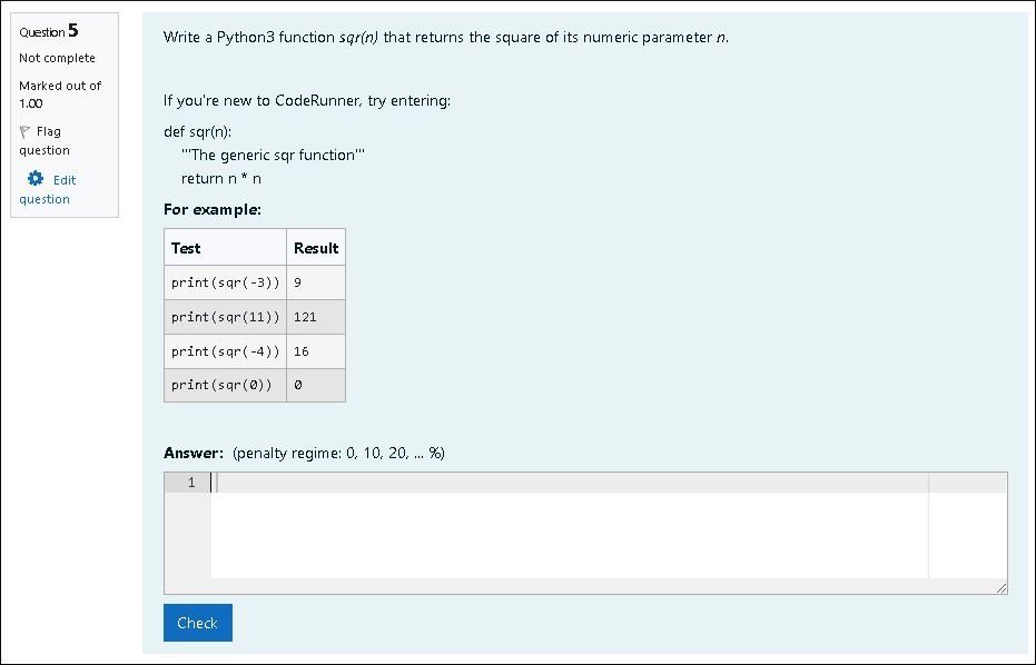

(This screenshot is possibly a poor example as I have a feeling that our students are talking about questions with partial pre-filled code - alas that is not actually mentioned in the feedback!)

As an initial idea, I'd assume a button using something like the JavaScript from W3C.


Selecting the button would mean the input area fills the browser screen. However, there would need to be a 'Return' button (which pressing 'Escape' would also do) for students to exit.

I would also assume that they'd need to be a question setting for those who don't want the extra button for minimalist interface reasons. 

I had a quick search and couldn't see an obvious previous request for a fullscreen feature on these forums. We're happy to code it and send it to you if that's easiest.

Thanks for reading! :-)

In reply to Chris Nelson

Re: 'Fullscreen' button for coding area

by Richard Lobb -
Hi Chris

Sorry about the delay in responding - I took advantage of Queen's Birthday Weekend and had a short holiday (we take royalty seriously in the colonies!).

Many thanks for the suggestion. I can't say I've ever had anyone mention wanting a full screen editor, and we do try to make the num_rows variable for the answer box big enough to allow most reasonable answers. However, I'm all for giving users options if it can be done without cluttering the UI too much. Also, one situation where we have wanted larger answer boxes has been when using other UI plugins, particularly the GraphUI. So provided your full-screen option works with all UIs, not just Ace, I think it sounds like a worthwhile addition.

But rather than having a big blue button, and then an option to remove it for those wanting minimal UI clutter, how about a small unobtrusive 'full screen' icon like that from You Tube ( ) or similar (e.g. )? I think these icons are familiar enough to web users that they would be found by anyone wanting to go full screen. And presumably the Esc key to revert?

So ... sure, if you're happy to put a prototype together I'd love to take it for a spin.

As a slight aside, if your students are programming directly in the web page, you might be interested in a new question type that we've used this year in our introductory programming course. There's a demo on this site, here. We call it python3_scratchpad as it gives students a secondary Ace editor instance which we call the scratchpad, where students can experiment with any code at all - even code that draws graphs - without actually having to submit ("Check") code into Moodle. It uses the new CodeRunner web service to run code directly on the Jobe server. We found it invaluable this year since we were in lockdown and trying to teach students remotely. It let them do all their programming directly in our web pages, without our having to get them set up with development environments on their own computers. They seemed very keen on it. It was almost too successful: we've had trouble weening them off it onto an IDE for more difficult programming exercises.

Anyway, thanks again for the 'full screen' suggestion. I'll now move onto your next suggestion :)

Richard
In reply to Richard Lobb

Re: 'Fullscreen' button for coding area

by Chris Nelson -
Thanks for the comments, Richard.

Once we have some time spare (currently the start of the exams period leading to the holiday season over here in the UK), we'll send our proposed code on for you to review :-)